I took a day to do some learning. In case you haven’t heard of Flow, it really is the way admins will work in the future. To be honest, I’m already using Flow to clean up a record and then writing a database query to find all the records that need cleaning up. That takes less time for me than doing it manually or exporting to a spreadsheet, changing, and reimporting.
Years ago, I replaced the classic UI for our organization with a series of Flows that did multi object editing. It was very popular among our staff and it was very fast. (I presented the concept at my very first Dreamforce so many years ago!) Honestly, lightning has never caught up. However, the cost of doing that was very high and maintenance of the visual program itself isn’t cheap. Mind you, that was six years ago.
UI or screen flows are much easier to make now. And with the right screen components added, they look just like lightning and can be launched in a popup modal box, right on the page, or even in a hybrid where a button turns into a flow as if the curtain goes up. The buttons and flows can be conditionally visible based on the data record items themselves.
Record Detail Flow Screen Component
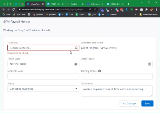
If you desire to show and optionally edit one record, I highly recommend displaying using the Record Detail flow screen component. (https://unofficialsf.com/the-recorddetail-component/) Simply giving it an ID and the fields you wish to view or edit, you get a nicely laid out page with good features and lightning look that goes with your page. If you have a group of records to edit, you can progress through each of them with next and back buttons.

Data Table Flow Screen Component

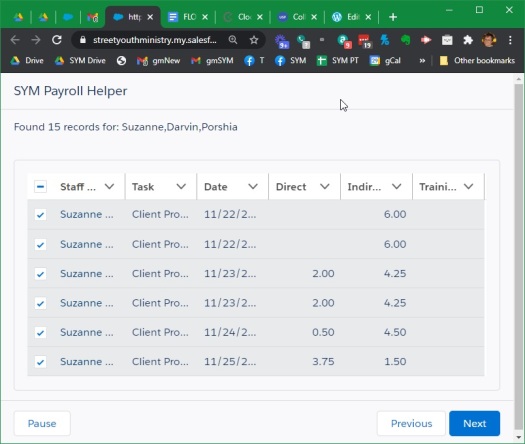
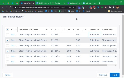
If you have a group of records that you wish to show the user, perhaps for information or maybe in order to select one or several of them, I highly recommend the Data Table flow screen component (https://unofficialsf.com/datatablev2-lightning-web-component-for-flow-screens/). You can get the records and then pass it in the collection along with which fields to show. You can make one record selection or several (or have it for display only). You can allow inline editing as well. And again, it fits in with your lightning page style.
Example Application
These two components allow a very powerful screen flows to be built very fast. Here’s an example of a utility I built for myself. People submit timecard data in several ways, but it all ends up inside of Salesforce. Until approved, it has no date paid field value. Once every two weeks, it is my job to find all of the applicable records, fill in the payroll date, and peruse the records to make sure there aren’t typos or duplications. So, I built a flow to help myself as follows with each number being one flow element:
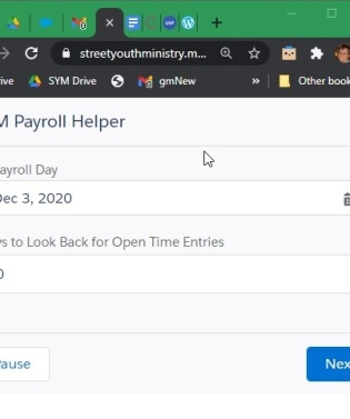
1. Capture a couple of inputs related to the current payroll dates.
2. Find the open timecard entries.
3. Display all of these records with a Data Table flow screen component and allow selection of the ones I wish to include in the current payroll. All I needed to do was give it the record and specify the fields. It will show me results of the number of records selected and a collection of the selected records.
4. I used an installable flow action to extract a string of all the employee names. All I did was pass the collection and ask to extract a list of for a summary of the employee names with deduplication from the collection. (See https://unofficialsf.com/list-actions-for-flow/) If I had to build this from primitive elements in Flow, I would not have bothered. But this nicely added one element to the flow and requires no maintenance or Debug.

5. I set a collection variable to the output of the selection 2 steps above. This technically shouldn’t be necessary, but it is. Perhaps it could be eliminated by manually saving the upper variables from the data table above. But I’m using all automatic variables since it’s so super easy!
6. I created a loop to go over each of the selected records because we need to set the payroll date for these.
7. In the loop, I first assign a new record variable, the ID, and the desired payroll date. I only populated two fields since that’s all I’m changing.
8. Still inside the loop, I added this new but updated record to a collection with a simple assign (using add feature that supports collections) so I can update the collection at the end of the loop and avoid any data write limits that might get hit by a loop going really fast.
9. After the loop completes, I update the records in one save using the collection. Record updates aren’t necessarily instant. In fact they don’t commit until the flow ends or you pause the flow or you hit a screen element. Thus, I displayed a screen telling the user how many records have been changed to the current payroll.
So now I have the potential records selected and the payroll date set. On to the next part of my job which is reviewing for any typos or duplicates.
10. I used to get a record element to find all the records associated with the payroll date into a new collection
11. I used a Data Table flow screen component to display the collection in a nice neat table that is sortable and filterable! All I needed to do was pass Data Table the collection and list of fields to show. One of them has a comment field, so I told it to display that wider. Note that this field also has a normal wrap text option of lightning on each column.

12. I saved the output collection from the Data Table to a new collection with a single assignment so I could loop through it. Again, they shouldn’t be necessary and could be avoided if I manually set the flow outputs from the above data table.
13. I looped through the selected records in order to display and edit them. Data Table also offers inline editing so I could have done some editing in the selection step, but I decided to give the user the experience of selecting the records and then editing each one. This will also be a better experience on mobile with limited screen space.
14. For each record that was selected, I use the Record Detail component to show an editable layout of selected fields. There is a cancel concept button which I re-labeled as no change needed. I had to tell the display record to advance each time the supplied “save” or “no change needed” button was selected. I got a very nice lightning record layout that allowed me to change look up values, numbers, text, long text, and picklist values. And it saves immediately.

Summary and Outlook
That’s the task that I do every two weeks. And now I have a simple helper friend to guide me. It’s a long linear list of elements, but at no time did I get into specific field layouts and data variables. I just relied on base and components to do their job.
In the old days, my user interface flows took page after page after page and involved very detailed screens that took a lot of time. No longer. (I am slowly going back and replacing pages of flow with much smaller routines, but it all still works so… hey?!? I’m mostly focusing on that when something needs a better UX.) I have full control and very quickly I’m able to render very useful flows for my users. Yay Flow and the amazing Flow Community!
This is development but in a declarative environment. Make no mistake about it. Very powerful stuff. So powerful I have to call this style of Flow something other than flow: Meta Flow. And Salesforce just keeps on cranking out stuff. Dreamforce 2020 shows prototypes of things that let us organize automations, screen flows, and code into stages, separate them by decision pathways, and even invoke AI at the right places. So much more than Process Builder or Workflow Rules. More is on the way. If you don’t know flow, you will be left behind I fear. Get started now! #AlwaysBeLearning!


