The release notes can be found here inside Salesforce Help.
The first step is to determine if there is anything requiring admin actions now.
- Sometimes they have little surprises for us that require action quickly before your users discover the changes.
- I head to the section called “How and When do Features Become Available”
- Find Your Reports and Dashboards Faster in Analytics Home: Requires enabling a global setup under Reports and Dashboards Settings: Unified Experience for Analytics Home. I had already done this in a previous release.
Review of limitations to features:
- Clone Lightning App: This beta feature is available only for custom Lightning apps. It isn’t available for standard, connected, managed, community or classic apps. Cloning of a utility bar isn’t supported in this beta release.
- To Do List: Track and Sort All Your Tasks with the To Do List doesn’t work on mobile since it’s embedded in the Utility Bar.
- Dynamic Related List still doesn’t support mobile, or tell you if it’s showing all the records.
Here is my review of the top items I was excited about from the release note preview. By the time they arrived, I’m only truly excited at this moment about items 4, 6 and 8 to be honest. The others may be awesome but I don’t yet see how to make them super useful in their current forms. But I’ll start using 4, 6, and 8 right away and be looking for applications or improvements in the others in future.
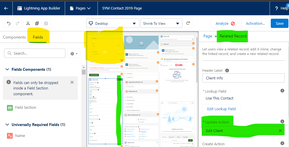
1. Account, contacts and opportunities now support dynamic forms in beta. (Custom objects already had them.) If you haven’t tried out dynamic forms yet, it’s well worth a look. Unfortunately it doesn’t work on mobile. I’m very reluctant to recommend features that aren’t fully supported, which includes all devices. Such limitations dramatically drive up cost of ownership over time for admins. Users increasingly use tablets and mobile phones. But if dynamic forms only on large screen devices work for you, then it’s now available (shown in yellow). We’re still using the Related Record component (shown in green) because it displays data on mobile and desktop and allows edit on desktop. We use a “Edit” Quick Action button to provide edit capability on mobile. It’s not perfect but it gives us one design method and (more importantly) one User Experience that works for all devices. I hope someone from Dynamic Forms is listening! I can’t recommend adoption of dynamic forms yet because users are mobile and we need mobile support! Let’s get real and stop launching features without mobile support! (Note: We’ve tested other page componentS that provide full field support on desktop and mobile but still prefer the UX of Related Record).
2. View Custom Report structure as you select the report. This beta helps guide end users in this crucial step of report making. Unfortunately, it renders so poorly in a preferred browser that the information is hidden and hard to find so I think it won’t make much difference to your users right now. Report super-users can reduce magnification of the browser and see the data but text isn’t legible. I hope this is fixed soon. If anyone from reports is listening, we also need to see the report logic when there are multiple items. Preferably when selecting the report type but also right on the report itself. This would help superusers a lot! I hoped that the Analytics home page would help make all these come together, but in my org, the Analytics home page has disappeared with this release. It was present before rollout. So I’ve put this whole feature into the disappointing section. Maybe next time!
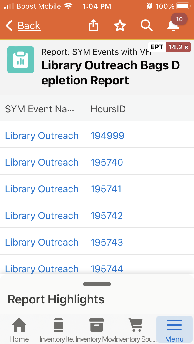
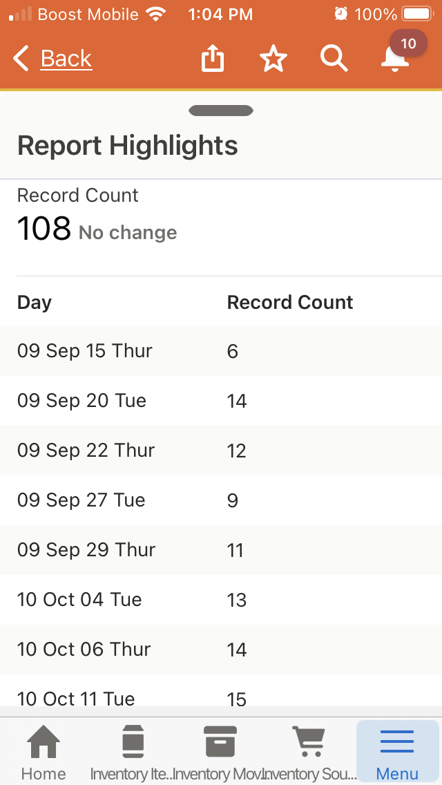
3. Mobile reports are better. This may be true, but I couldn’t detect much help. That said, we have several inventory tasks that I routinely perform using mobile that involve running reports for which the key report link is stored on the object, scanning the results to come up with some numbers, and then making inventory change estimates based on the recorded program activities. (We need to automate it but this is a big step for us just to have a handle on it.) The docs state we get a responsive user interface, faster load times, and more consistent performance. If you haven’t used mobile reports, they do work. You get a scrollable details section at the top of the page and an expandable “Highlights” section that you can pull up from the bottom. It’s a bit more interesting than the report highlight section at the top of a page on the desktop. It includes the summary information from groupings in a scrollable format.
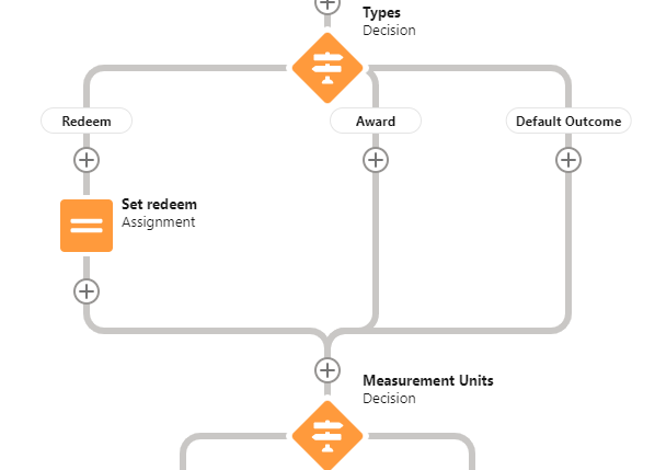
4. Flow Builder: Cut and past items. No longer do you have to switch to manual routing mode and rewire the items to move a section of elements and deal with wrong resource names along the way! In this case, I wanted to move an entire decision branch from below another item to before it. I was able to do that just be “cutting” the decision element. I was prompted to cut all paths (which is what I wanted). The cut items were shown in shadow form while I found the right “+” sign insertion point. When I pasted it at a new point all looked great and resources names were exactly the same. And I could still undo! I found no way to cut multiple elements other than the case of cutting a decision and it’s related paths.

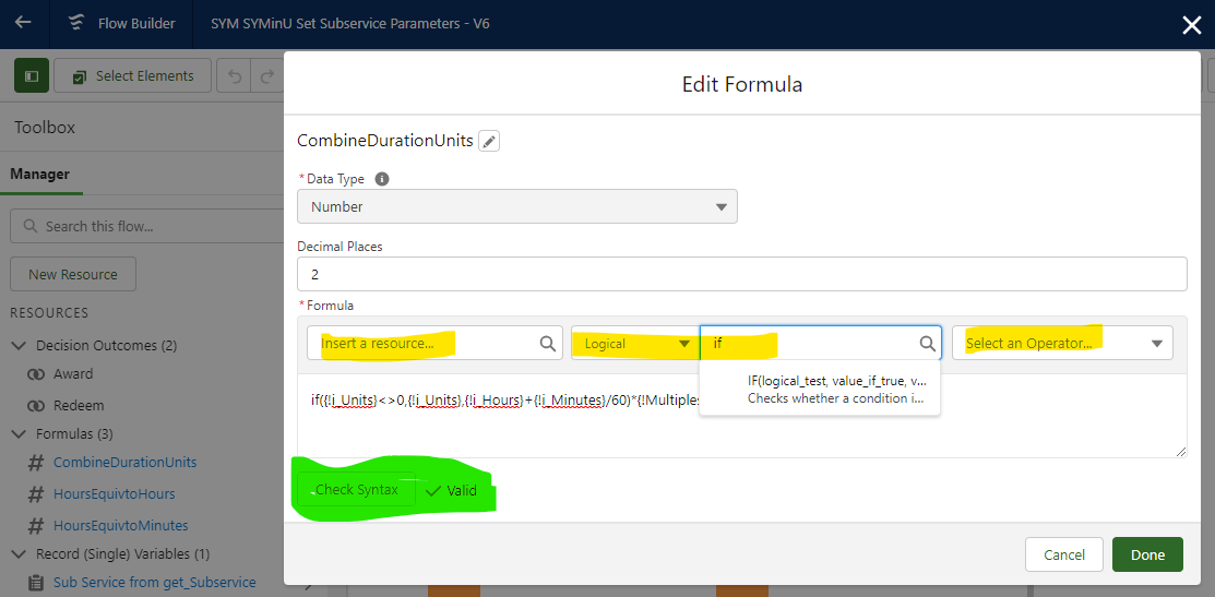
We also now have access to a modern formula builder with verification of the formula before you save. The verification (shown in green) takes place when you press the button (rather than when you save the flow.) You can also insert syntax correct functions and operators (shown in yellow). So much better!
And we have more screen space for our editing of designs in two ways. First, the resource toolbar on the left side of the flow builder screen is collapsible. The area previously used is shown in yellow as is the uncollapse button. A guidance bubble tells users where to find the collapsed resource list initially. Second, the screen editor with a much larger footprint in the pop-up window. The extra space is highlighted in green.
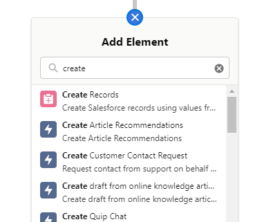
The add element menu has a new search filter so you can get to those items down at the bottom without scrolling. As an example, Create Records. This includes not only the things present in the menu from before but also a search of items that previously required opening a sub-menu, such as Actions. New users can still click Action and get a pop-up to browse to something unfamiliar. But when doing repeated addition, you can also just enter the action name in the search box and click (bypassing the pop-up altogether… example all the create actions and sub-flows shown). It’s intuitive but faster and a better user experience.
5. Flow screen user experience: Visibility of screen components can now be controlled by a dynamic field. Previously you had to use a custom-defined resource to control visibility. This lets you quickly build screens and make them dynamic to boot. Users really expect this type of experience in all their screens. Now we can build fast and still meet UX expectations.
The standard lookup component can now allow selecting multiple items. This reduces the need for user loops to do the same processing to several records. Unfortunately this standard component still does not support filtering. I almost always find that I don’t want the user to select from all records but rather need to apply a WHERE clause or a filter value on a field. I continue to use a custom add-in component called lookupFSC where these useful functions are provided.
We now have a brand new native Data Table component that can serve two purposes. It can display nice compact information from a set of records in flow. And it can provide a way to select one or more records from a selection, displaying several fields on each row to support differentiation and selection. I’ve been using an add-in data table component for a year or so and it’s been a game changer! Think of it as having a listview inside your flow for helping the user get things done quickly and intuitively. Unfortunately there are many reports of bugs in this first native datatable in how information is viewed, so it may not be ready for prime time. I’m not going to migrate my old custom add-in Data Table component yet.
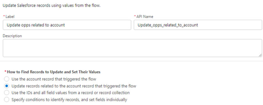
6. Expanded Flow Power: Record triggered flow can now update related records much more easily and powerfully. It’s a nice dialogue set to update related records and even filter them. Or you can use a collection:
We can now use sets to help us get, update (or delete) records we need with an IN and NOT IN filter criteria on the get and update record operators. This gets translated to a single database operation so we’re not going to hit limits as easily. The set to match or exclude currently must be a text collection. So you could, for example, get all your most important accounts, put all those account IDs’ into a text collection, and the get all the open opportunities matching any of those account ID and display them in a DataTable. There is an add-on unoffcialSF collection library that allows collecting all the unique ID’s of important accounts from a record collection. Or you could loop to do the same thing natively before getting all the related records you need.
7. Clone Lightning Apps. It’s no more a pain to create a duplicate app (from a managed set or from your own custom apps.) We use a “Beta” App to validate our user experience changes for our record and home pages seasonally and it’s a pain to create and copy all the pages and App. Once I turned on this new feature on the Apps setup page (you can turn it back off), this offered to clone any app that isn’t classic or managed. Unfortunately, it does not give an option to clone the pages. Any edits to the cloned App Lightning record pages will impact the original App. So this easily lets you repackage an app so you can add or remove pages but cloning each record page so you can change it remains a manual task.
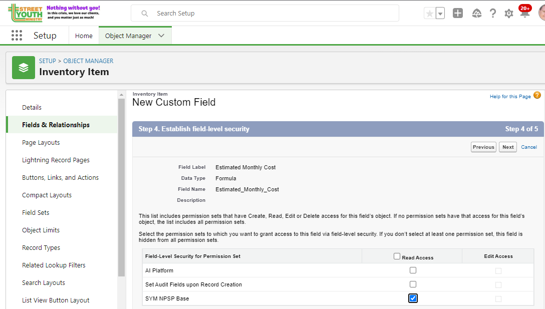
8. Permission sets go mainstream. When you create new fields for a record you can now assign access to a permission set instead of a profile. I only configure users via permission sets these days so this is a welcome change for me! First you must enable Field-Level Security for Permission Sets During Field Creation (beta) in User Management Settings. IT’s a toggle and you can turn it back off. Then when you create a new field on an object, you get asked what permission set to add it to instead of what profiles to give access. Enable Field-Level Security for Permission Sets During Field Creation (beta) in User Management Settings. In my case, we didn’t have any permission sets with this because it was still controlled only by profiles. But once I added it to the right permission set, it worked like a charm.
And a tool that has always been around (called Permission Helper) has a new name and appears on its way to being a regular setup tool. It allows management and analysis of permission sets. I look forward to configuration instructions for all tools to be worded in terms of permission sets instead of adding access to profiles.