So the release occurred in my org on Jun 9. Lots to unpack. My goal is to create a list of must-do and nice-to-have advice for small nonprofits who have the Power of Ten license grant. I only review the included features with Power of Ten, even though I have paid licenses to some additional products.
The release notes can be found in a nice searchable format here: https://help.salesforce.com/s/articleView?id=release-notes.salesforce_release_notes.htm&release=244&type=5
The first thing I always recommend doing is go through the “How and When Do Features Become Available?” section. Never skip this if you don’t like surprises coming at you! Look especially for features in the first column that are on for users automatically or feature improvements that you really like that require admin setup. Here’s what I saw of note:
Users with multiple browser tabs now see a lot of information in the tab name: Record Name | Object Name | Salesforce. If you have users who use lots of windows, this is nice but will likely take some getting used to.
Undo arrow on record pages. When you do edits on a record page, changes accumulate until you hit save or cancel. Now there is an additional choice to undo each change one by one until you hit save or cancel. No undo of changes once you hit save! Best to explain this one to users.
There are some visual differences in pages all over the place. Some users really don’t like change on pages where they live and work daily, and it may be worth explaining to them that the color of just about everything changed a bit to help those with visual diversity. It’s also worth noting that record home pages and related lists now render using LWC instead of Aura technology, resulting in a few changes that some users may spot. The best ones are that record pages and related lists are slightly faster and more consistent with other more modern elements.
A planned passage to note: Salesforce is retiring the automation that goes out and finds suggested fields and fills in name, address, web fields automatically. This is a feature I’m going to miss; it was really nice for having clean employer orgs for affiliations. Users will now have to find the information on their own. The account log isn’t updated any longer. I never figured out how to do this outside the automatic feature… And the automatic News feed feature is also gone.
Now onto the fun part! Exploring the new features that require adoption effort so we can decide how to stay current and avoid technical debt! Here is my top list:
1. Application pages get tabs and accordions. I recommend making pages that have utilities on them when users need to do something that’s not related to a specific record (like make a new one) or do something to a group of records. You can use a utility bar or the global action bar (“+” sign), but these don’t work on mobile and have several usability or maintenance issues. I recommend that you add a utility page to your apps instead. It might be the same or it might be custom per app. In fact, we have a whole standalone app that is nothing but utility pages. It works on desktop and mobile. However, now it’s much better because we can deploy with a tab.
On a desktop you see just one tool at a time, each in its tab. I also like to include a tiny guidance line at the top (not “displayed as card” so you get a transparent background) and a more detailed hint section and change lot at the bottom. This renders great on a desktop with the default tab open and ready to go.
And it renders on mobile as a set of labels, one for each tab, that you can click into. Notice how the initial line of text sort of becomes the prompt on mobile to click further into the detailed task needed.
Previously, apps and home pages had to have everything on one screen. Now we can expose decent guidance and put things in tabs or accordions to improve the UX And navigation and decrease load times. It’s particularly nice to put an element that has a dynamic screen height (like a flow) on its own tab so things don’t keep rendering and rerendering as the element changes height. Components can be conditionally visible. Salesforce has yet to see the light on bringing us conditional tabs and accordion elements. It’s going to be great when they do!
2. Dynamic Forms Comes to Mobile as a beta. This is fantastic news! Dynamicism is about showing or asking for information from your user in logical and “alive” ways. You can group fields into logical collapsing units, including repeating fields between sections. You can hide sections or fields based on other values, calculated or entered. And you can spread sections out onto multiple tabs or accordions to improve performance. The architecture page makes clear that we should be using Dynamic Fields and LWC for all UI design at this point and no longer invest time in page layouts. https://architect.salesforce.com/decision-guides/build-forms. This is well worth a read.
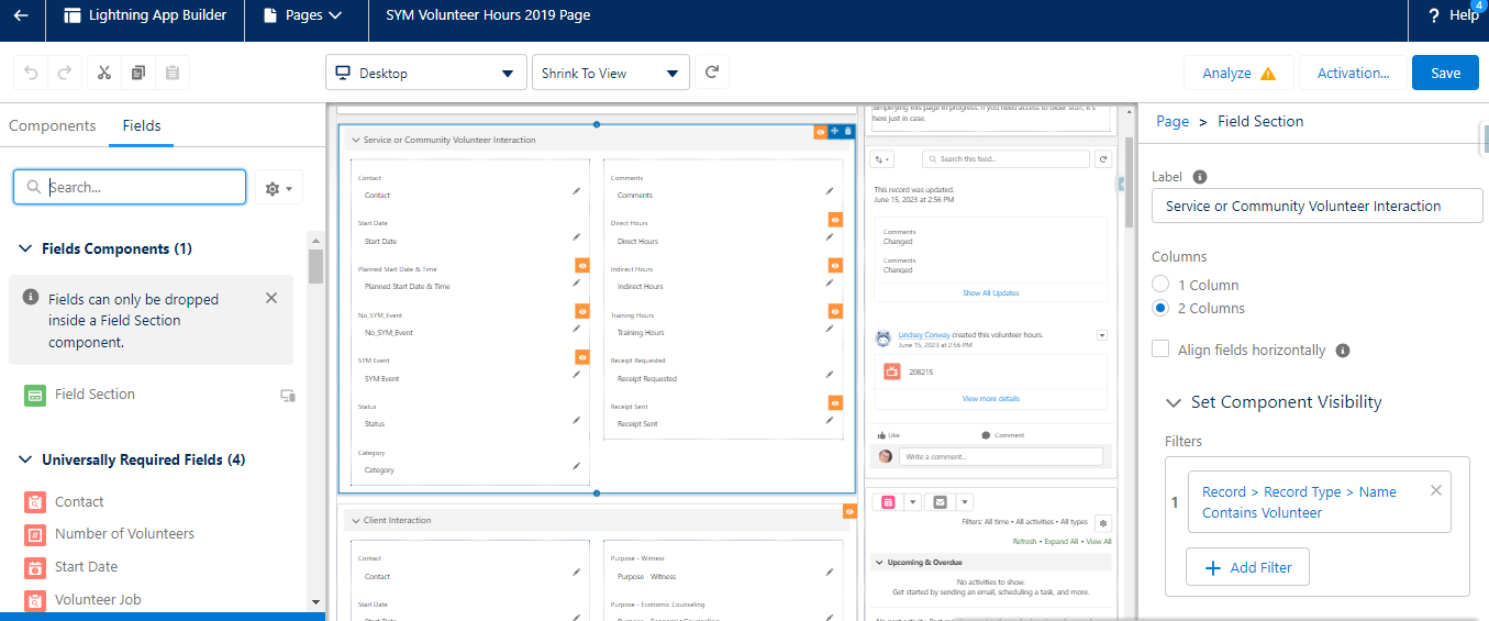
I’ve been working on better layouts for many years in Salesforce. First we had classics with collapsing sections. Then we had Lightning with i’s detail tab. Then we got the Lighting “This Record” hack using the Related Record Component to display conditionally a set of fields including repeating fields (although it doesn’t offer editing on mobile). Then we got dynamic forms (but no mobile) to make sections and fields conditionally visible. Finally we have mobile dynamic forms! By adding multiple sections with conditional visibility based on the record type, we can have different record sets displayed. You can break information into logical related areas and even include duplicate fields if it helps the user. You can make different fields required in different sections. But best of all, you can use conditional visibility to have certain fields visible only as needed or as data entry progresses. This screen shows two different sections which show mostly different fields based on record type. They also use field visibility to only show the fields they they are relevant.
Dynamic fields live in one or more sections which you place there in the Lightning page editor. As soon as you put a section on the page, not only does the record page look different but the pop-up pages for edit, new and clone change too (desktop and mobile)! They stop using the assigned page layout and rely on the field sections instead. This means dynamic forms is an all or nothing type of conversion per object IMO. You’ll likely want to opt into the mobile beta (available to everyone in the mobile app settings page), and then follow a process to release optimized page layouts. Here is one suggestion for a process that I’m trying:
- Choose an object that has a lot of fields,
- Duplicate your current “details” component and put it on a tab labeled “old detail view” for safe keeping
- Convert your existing details component to dynamic forms using the handy automatic conversion in the Lighting page editor. You may want to put it on a tab called “full details view”
- Design a beta page layout for a few “super users” to try out. You can put it in a “beta app” so they can switch there and still get back to the original page if they run into trouble.
- Put top level summary fields where they will be seen initially,
- Push detail fields into specific tabs and sections,
- Apply conditional visibility to make fields visible only when they are relevant by profile, role, user, device and/or field
- After acceptance testing for a trial period, release it to everyone by changing the assignment of your default app.
There is a ton of user experience functionality hidden in these two words: “dynamic fields”. Here is what I learned:
- Sections work and appear on mobile and desktop record views, where they are collapsible. Sections also work in each of the edit, clone and new dialogs on desktop and mobile. Sections appear as headings in the dialog boxes in top to bottom, left to right order they appear in the record page, I believe. Sections is where you tell Salesforce you want to align fields horizontally, which is a new feature for this release making a lot of people who like pixel-perfect layouts happier. Do be aware the two column renders first column then second column on mobile so alignment is pretty but does not carry left-right association on mobile.
- UI read only settings and required per field work on both desktop and mobile. It’s also worth noting that most admins have the “allow edit read-only fields” set in their permissions so edit capability may be present for your profile even if you tell dynamic form that you want a field to be read only. Test with a different profile to see the requested behavior. You cannot turn off this capability in the System Administrator profile but you can use a different profile for your admin role and set the field as you like (via a permission set, preferably).
- In-line editing of sections works on desktop record views but not mobile (but the edit button works on mobile).
- Collapsing field sections work on desktop and mobile but only on the record page. They do not collapse on the edit, clone or new dialogs.
- Repeating fields works on desktop and mobile and also repeat in the edit, clone or new dialogs. The browser code does a cool thing in the dialogs. Enter a value in the first instance of a field, scroll down and enter a different value and each of the repeated values change. So there is only one value that gets saved.
- Conditional visibility for field sections works on desktop and mobile. And it works in the edit or clone dialog box and remains dynamic for the fields. It appears that dynamic sections work in the new dialog if you base it on record type, too! Changing values will not add or hide a section in the dialog box like it does on the page.
This on mobile, a new VH results in this dialogue box after you pick that it is a Client Record. Note that the volunteer section is not displayed.

- Conditional visibility for fields works on desktop and mobile. It’s dynamic–change a value and conditional fields appear or hide. And conditional visibility for fields works dynamically in the dialog boxes. These fields appear or hide in the modal dialog boxes as you enter or change values.
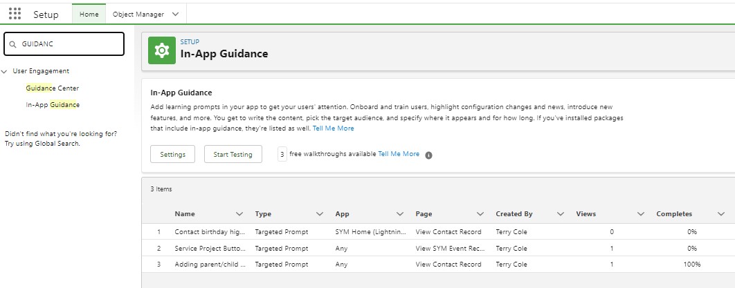
3. In App Guidance targeted to specific components on record layouts. This is new but In-App Guidance has been around for a while. And Salesforce seems to be adding more and more standard guidance items. You can turn them off in the Guidance page settings. Unfortunately it’s all or nothing and I found no way to find a list of what Salesforce has added so far.
You can also add custom guidance prompts. You seem to get an unlimited amount of single pane guidance options and you get three active sequence guidance apps for free (up to ten panes). I added several new custom single-pane guidances:
Click new on the Guidance settings page:
- Navigate to the page you want and choose targeted and select whether you want just this app and page or any app this page (and a few other combinations).
- Hit Target Mode and then pick the element you want to explain. This is shown in the first screen shot. I added no highlighting.
- Then hit next and enter the title and text. This is shown in the second screen shot.
- Save by providing a url for further information (it’s on the guidance tab), title, frequency, and repetition. You can target certain profiles.
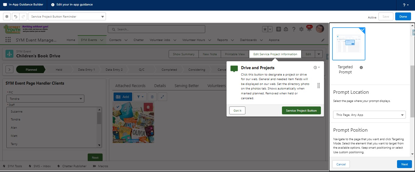
Your custom guidance will be shown to users at random times when they are on the right page. I usually do a Loom video for complex options so I can narrate, but I will be doing single pane guidance for all new items we added as well as to items for which we want to improve data quality or usage.
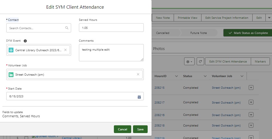
4. Related List Bulk Quick Actions
So this one is a bit more exciting than I thought. It’s beta (but available to everyone and requires no opt-in). It allows adding quick actions to a desktop in two ways. First is the old way… you can add it to the classic page layout and it will impact a single related list component. Or you can add it to the new dynamic related list component. Check the box for Show quick action menu. Then you pick the actions.
The user then sees the regular list view but with checkboxes on the left. If they select one, the quick action runs as usual. In our case, we have an edit client program delivery quick action that pops up the related fields (including custom fields we added). Update and save. That’s nice. But the real power comes when you want to change all of the entries (or a select group of them). Select the right items and click the same button. This time it shows you the same fields but the record field for the changing element will be blank (e.g., Contact). You update the fields and a little notice at the bottom of the pop-up shows you which fields will be updated. Hit save and a warning box says it is about to apply the changes to multiple records. Approve and it’s done. All without leaving the page. Now that’s pretty nice!
5. Send Email Flow Action Updated
The email flow action out of the box now supports classic or Lightning email templates and will log a closed activity to the related entity. I think it is really time to retire the original V4SF workflow actions that send out reminders and use flow to do it using Lightning Templates. This will allow non-admin users to maintain the notifications for volunteers, plus we can have an option to send a test reminder as well (since we have a text provided integrated into Salesforce.)
6. Flow Reactive Screens Improved
I’ve been using conditional visibility quite a bit lately to make screen display information as the form progresses on the same page. I covered this in some detail in my Summer 2023 Preview article. However, the reactive flow beta (open beta which everyone can opt into in settings) continues to evolve and new components are starting to appear on unofficialSF and the AppExchange. For this release, a very powerful item became reactive: formula resources in flow. This means that you can ask the user for input, and the formula will change as they type rather than only when they go to the next page. The simplest application is to have a formula that calculates the default value of another field. If you type 3% covered fees in the form, the total donation amount would increase by 3% on the same page in real-time. Perhaps not an exciting example, but I hope it serves to inform. In this example, the formula is dynamic plumbing between two screen input fields: one in which the user is typing now and one at which the user is looking (and can still override).
The more exciting applications are using formulas as plumbing between more complex elements. Salesforce has not enabled many such elements. There is a new component on the App Exchange called Data Fetcher. It retrieves records as a Flow Screen Action from a Soql Query. It’s only a screen component so that it can act as plumbing. You can feed it a formula (dynamic) and it can return a record collection (which can feed a data table dynamically).
I don’t consider this a simple feature and it’s going to take some time for admins and architects to come up with design patterns in flow that work reliably and make sense to adopt. Most are going to leverage a custom LWC component, whether loaded from unOfficialSF, App Exchange or developed. The good news is the development lift is light and likely reusable across multiple flows.
I will begin designing new flows to make significant use of dynamic fields and even dynamic components. But it will take time..